...art is a by-product of the experience of being with yourself, of living within patience. -- Robert Beer

31.7.06

Thursday again?

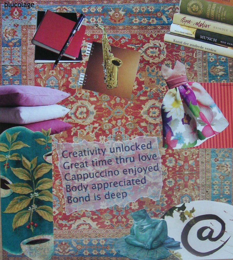
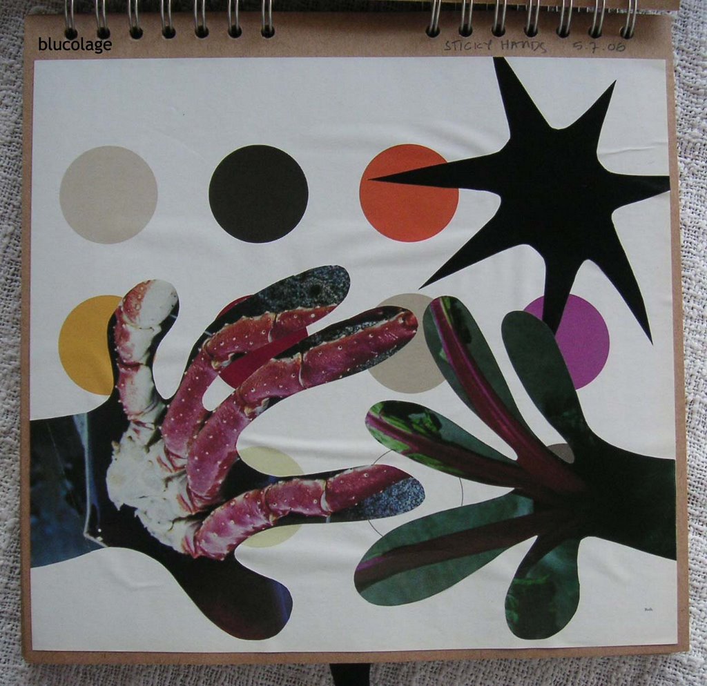
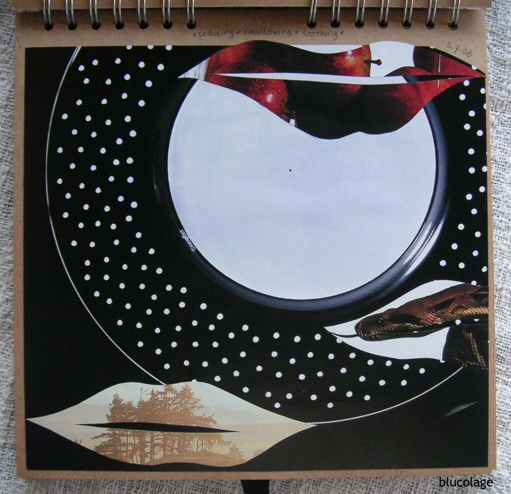
Inspire Me Thursday: Music (non-visual art form)


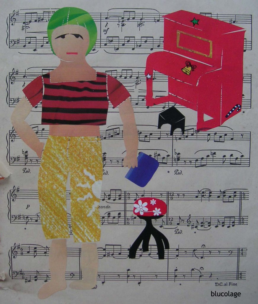
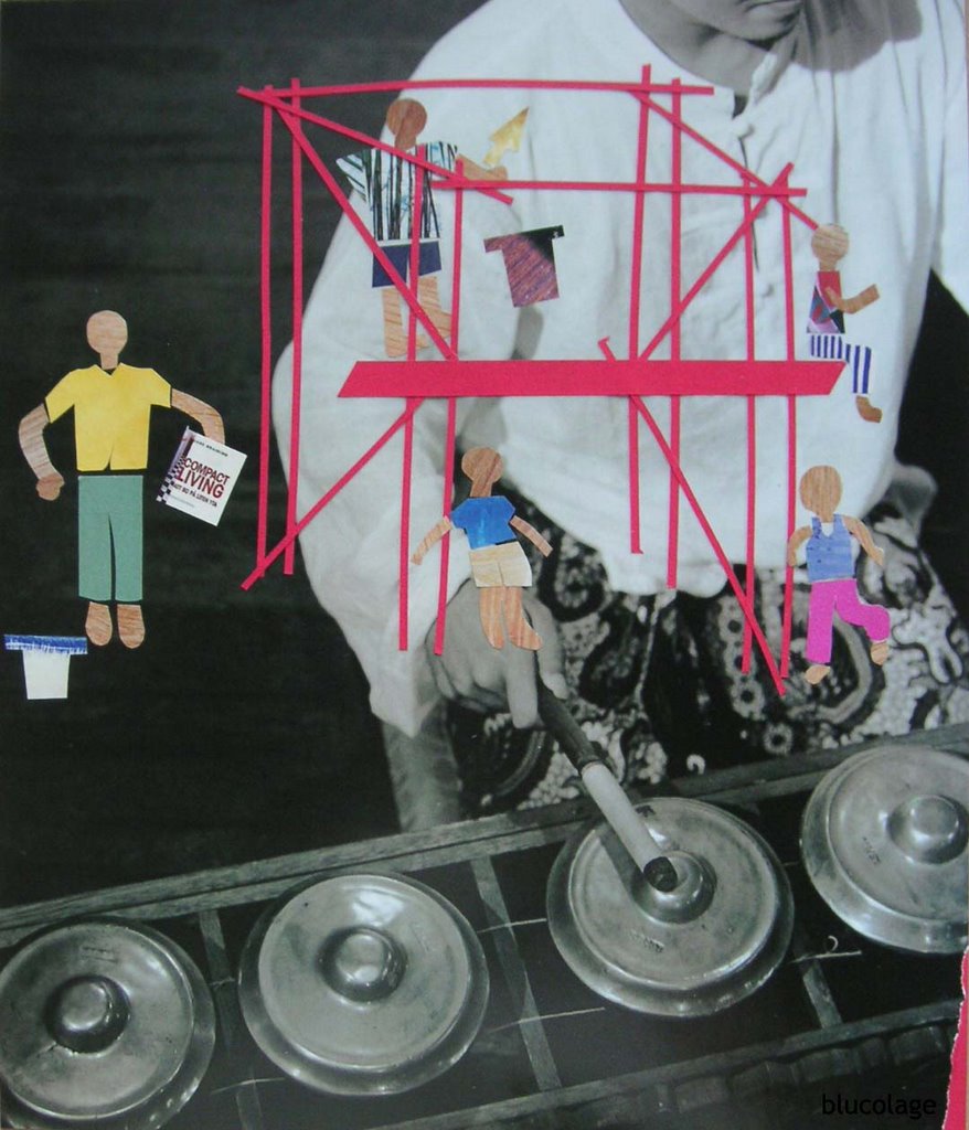
Again, this collage is ‘product’ of my visit to my hometown. IMT theme is music (non-visual art form). Music connects me to a piano in my childhood home. It reminds me of my Thursdays 35 years ago :-)

I started to have piano lesson at home when I was 5 years old. I was so small that I needed a little black wooden stool for foot step. The lesson was once a week – every Thursday – at 16:00 for one hour. The tutor was a young short man that.. I didn’t really like.

I didn’t enjoy my Thursday afternoon for sure. I tried to find reason not to have lesson but hardly to get one. I had to get up from nap around 15:30 and got ready. Ugh..

I had the lesson for eight years, I recall. I stopped after I entered high school. What I got from those eight year? I can play piano – classical – but I do not excel. Later Mama told me that I should not have started too early, no passion from inside. Still, I’m glad that I can play now and surely will take piano lesson again in the future. With passion and no more…

Thursday again?

30.7.06

Yu Sih

Illustration Friday: Clean


“Clean” is not an easy theme. I could only think about soap suds and things related. I didn’t have ideas till I saw Yu Sih (Yu = big sister) passed the room. Aha! She is perfect model for my “clean” theme.

I’m visiting Mama in my hometown, Malang, now. Yu Sih is Mama’s helper. She worked for my Grandma for over ten years till Grandma passed away in 1996. So up to now, she has worked with the family more than twenty years.

She helps Mama in the kitchen, in the garden, and cleaning the house. I cut 1993 magazine I found in Mama’s library. I used detergent ad as background with washing machine picture. I fixed fridge and Anthurium flower n leaf pictures. Mama collects Anthurium.

Yu Sih cleans..

29.7.06

Navigate Your Day


The other day NIE told me that she made sculpture about two ladies on dining table but both are busy with cellphone, even one with two cellphones. NIE is disturbed by the new phenomenon where people are more connected to cellphone than to the real people around. She is right.

This collage was inspired by NIE. I pictured PEN, myself, and RIT. NIE is not in the picture, she was hardly on cellphone.

PEN needs glasses to read text, I usually checked text discreetly (under table or inside handbag), and RIT needs glasses and holds cellphone very close to eyes to read well.

That’s how we navigate our day!

27.7.06

Where is the gamelan?

Studio Friday: Music To My Ears!


This is the sounds that fill the empty spaces while I’m in studio during the day time. Drilling, hammering, tile cutting, truck downloading,… My next door neighbor is building a new house.

I wish I could hear gamelan instead…

Summer Girls


26.7.06

Get connected!


I did cubism in this artwork. No bend cutting, all straight and sharp. I wanted to see whether I was able to capture the image well using this style. Curvy lines are nice and more human, but straight cut could do nice too.

Get connected!

24.7.06

Let's have lunch!


I study more about human body in this collage. I captured my good friends’ character in different way – not the face part, but other parts. Lower body, shoes, and handbag.

I sketched each body in separate tracing paper. Then I compared the bodies to make sure I made the right proportion. The rest was fun – searching the right material for their stuff.

The one in white cropped pants – RIT – has been in my life more than four years. She is like sister to me. So dear. She never changes – always in white (with orange sometimes). And the black one – AMA – is always in black anytime, any weather. Her sling handbag is small for she likes to have her hands free. The similar two with skirt are NIE and I. We have skirts from the same shop so we have similar style, even we have similar shoes. PEN is always in light color pants and black thong sandal and carries small textile handbag.

I have known these ladies more than two years from the art group in Heritage. I met them almost every other Friday to visit artist or exhibition. I fixed painting by Agus Suwage, our favorite artist from Yogya, in a black lunch plate with chips and beans. It’s a perfect way to picture our relationships -- finish the art thing and..


Let’s have lunch!

23.7.06

Life of A Woman

Illustration Friday: Opposites


It took me more than one day to think about something that connects to "opposites" – this week’s theme in IF.

I considered myself lucky to be able to build the idea while flipping thru some woman magazines. I found two lampshades picture first (the breast) but still I didn’t know what to do with it.

Then it came to me the idea of contrasting femininity and masculinity. I looked for a stiletto (ultimate symbol of femininity). Hm.. it suits the feminine part – left side (coded by the color of breast ha ha). I found saw machine in a man’s hand. That’s perfect for the masculine part – right side.

A concept had been built. I had breast (in two contrasting colors), a stiletto, and a saw machine. Other parts followed. I found a fuchsia boots and a nice sequined night-bag for each side.

The main body was found later. Again, I’m lucky. It’s a perfect body in kimono that has both femininity and masculinity qualities. So here it is..

Life of a woman..

Shoo shoo..

Inspire Me Thursday: Child's Play


Interesting topic about using children’s art material. I have fluorescent oil pastel and colored pencil. I tried the former but I found out oil pastel doesn’t do well in magz paper. Sure, it’s glossy page. I ironed the excess but then I ruined the tracing paper I used to print a picture. For the first time I had to trash the 70% artwork. I learned tho.

Then I sketched again, I chose gecko this time. The past few days I used tracing paper for sketching. It’s easy to do cutting because the paper is transparent. I sketched using automatic pencil I bought the other day. This pencil is special because using colored lead, six colors, and the size is 0.7 – very soft. I like it because it has nicer effect than using the usual black lead.

I looked again my sketch and I liked it! I didn’t want to cut. So I worked more on the lines and fill up the blank with more colors. I made tiny tiny circles along the body instead of just coloring. The circles may not show in the picture. I really enjoyed doing it – like meditation by doing repetition on and on and on. I’m satisfied with the result. It looks like I used colored pencil (the usual type). The good thing about automatic pencil is.. ever sharp!

I made collage of frightened girl standing on a chair trying to shoo away the gecko..


Shoo shoo..

My Sidekick

Studio Friday: Studio Sidekick


This is going to be my first entry in Studio Friday. It may be too late now. I knew that Friday means the latest day after I finished the artwork. I will just try to submit then.

My computer desk is similar to the one in collage. It’s part of my studio although I don’t do collage there. I like to work on the floor next to the desk. I like limitless space and simply.. I like sitting on the floor.

Chiko, my sidekick, often comes and sleep on my lap. Or just hanging around..

21.7.06

W W W


This is my second study on human body. I’m interested in cutting human body since started doing collage but I haven't done well so far (any style). I need more exercise to picture body in good proportion or.. nicely deconstruction (small head, big body, or reverse).

For pop art, I wanted to create ‘funky’ style body. But it doesn’t come easy because I have realist mind; that body should follow the proportion of a real body. I tried to think outside the box by playing with size (over or less) and adhering the body parts not in ‘good order’ (deconstructing). My first trial, Lovely Short, looked successful. I could capture my hair style and my style.


Please take a lot of liquid especially when you are not well.

Water Wine Whatever

Lovely Short


A friend gave me idea to picture myself in collage. Why not?

I’m happy with my new haircut. Fresh like flower.

Enjoy my lovely short hair!

19.7.06

d e e p


In this artwork, I combine two artworks. A poem and collage.

I ‘visualize’ the poem by having representations of “the creativity, the great time, the cappuccino, the body, and the bond” surround the poem.

I enjoy it deeply!

18.7.06

Keep them under the table


This is Orrefors’ “Amour” ad. I liked the combination of heart shape vases and butterflies flying in clean white page.

This is about keeping the “sharp” under the table. Meaning: there are things that better left unsaid.

17.7.06

It feels like home..

Inspire Me Thursday: Numeral Art


This week challenge is Numeral Art. Very very unusual and interesting. I was eager to start creating since I checked the theme. I started to think about the number.

Like others, I have lots of number in mind. I chose one that came first, 37. My home and shop number!! Very real, very now.

I had started browsing my Indonesian magazines since last night. I have some travel and art magazines. I don’t read Indonesian woman magazines (I read… when in salon ha ha). Perfect! I found a lot of picture with cultural touch. Yes! I have made a lot of artworks with.. Swedish touch. I like simplicity but ethnic can be nice too for a change.

I didn’t want to cut an image to form numbers 3 and 7. That’s ordinary. I wanted something else and I found both numbers in dancer poses!

The girl represents 3. She wears Betawi (an ethic group in Jakarta) costume which influenced by Chinese.

And the man represents 7. He wears common Indonesian costume for man. Why is it common? Because many ethnic groups wear similar style combined with batik (shown) or other region textile. He wears big stone ring -- the style of old Indonesian man. If image is sharp enough, you can see cotter pins instead of buttons.

I put the image of Gedong Songo temple in Ambarawa, Central Java, in the corner. The image looks familiar, like home. All three images were done on sticky tape.

I put my words in kidnapper’s font. It’s not a poem, it’s just words..

Finally, why did I choose the image of drawers for background? It feels like home!

16.7.06

It is all in your mind


An art blogger gave me idea to combine artwork and writing. It’s nice! Not just ‘a caption’ but full writing. I wrote spontaneously. Not copying. This is my first of the style.

Enjoy being in control..

15.7.06

c H a O S

Illustration Friday: Sacrifice


This week’s IF theme is challenging: Sacrifice. There’s only one idea that popped up since last night – life of a mother. I didn’t want to think further, I better stuck to the initial idea. I started sketching.

Again, Belinha inspired me. She often has small pieces in her artwork. I challenged my patience this morning to do the same. I decided to give the mother three kids!! Five is perfect but… that’s beyond my limit ha ha.

I almost lost patience half way. Finding the right color for element was time consuming, although that is the art and the fun!! I got bored looking at my magazine’s torn pages.

I was happy after finishing the third kid. Pheeew! I felt like I raised the kids myself. Chaos. I used gold and silver pens to dramatize the scene. Satisfied. It looks a bit different than my previous artworks although one can still see the red thread (in fact, I wanted to go out of my style. Cannot!)

I respect the role of mother. She dedicates all of her time for family, especially for the children. She put herself after her family.

It’s almost 16:00, kids are in the kitchen. They are all over places in different moods. Mother comes with ‘light’. Children are like plants. They need to be looked after to grow well.

Mother deserves golden glitter for releasing her time for others.

Her sacrifice.

Enjoy the moment


This is my second sticky tape image transfer.

For base, it’s an image of horse saddle in the desert. In the background, horses running in the desert. I picture myself totally resting. I wanted to give the total image a bit color but I was surprised to see ‘my’ hair too red like blood. It took awhile before I got used to. Now I can enjoy it more..

I enjoy the moment..

14.7.06

Less Ordinary


Another room I like. Simple and clean with lots of white. Less color. Old table with stacks of book. An old wood pole leaning on the wall. Very me.

It’s Bang&Olufsen’s slogan. A life less ordinary.

13.7.06

my room


As usual, my artwork started from the image base. I really liked the picture of room with colorful cushions and throw. And the curtains… Oh. Very eccentric ideas. Vintage dresses as curtains. Home of Betsey Johnson, American fashion designer.

I liked the happy and free feeling of the room. I made my self image sleeping in the couch and falling off.. My dream is my mumble…

In “my” room..

10.7.06

Sweet Dreams

Inspire Me Thursday: Image Transfers


I was happy to learn about sticky tape collage in IMT. I was a bit nervous about inkjet image transfer because of the use of gel medium. I am novice.

I remembered practicing this technique thirty years ago (?!!!) in school but I could not recall the result would be. So I made a trial before started the real page. And it’s funny, my trial tape was not successful. I didn’t know how to ‘scratch’ well to get transparent image. But I just went on..

I chose image for the base first. I chose picture of an empty room with two doors. I printed my young face (from the day I learned the technique??) and my favorite image of myself, painting of a Bali girl.

I used narrow packing tape, local brand (not 3M) to make the transparent image strips which I took from an interior magazine. First strip is image of an artist’s desk. I liked the atmosphere in the room, very me -- desk with creative mess. Second strip is image of an interesting red curtain. Again, very me. Vintage. Bohemian.

I soaked both strips in water for 20 minutes. The longer the easier to take off the paper without much damaging the surface (the transparent image). It took awhile for me to get the feel of peeling off the paper under water.

I was satisfied with the result. It looked natural with chip here and there. I loved to know that the image colors really transferred to the tape. Brilliant idea!!

I arranged both transparent image strips onto the page. I showed the Bali girl painting in the window of the strip with desk. The painting shows very well. Then I put my image on the floor near one door. I gave color to the page by putting red curtain strip on the left hand side. Perfect.

I liked the effect of the plastic tape, shiny. The tips said that we can sandpaper the tape to make it dull, but for me.. this is new. Different shine in a page. So I keep the shine.

Two words completed the page. SWEET and DREAMS.

I’m satisfied with the result. The empty room, the two doors, my image and ‘image’, and the dreams I have..

Sweet dreams..

Three Lucky Pigs


Material

- 3 bronze pigs in different position
- Chinese ceramic beads
- seed beads
- black cord

Concept

These three pigs have weight. So I thought it would be nice to convert them into paper weights because they are too small as an art object.

But they looked too ordinary as paper weights. For Chinese, pig is a symbol of luck so I gave each of them Chinese embellishment. I tied Chinese ceramic beads to their necks then combined it with colorful seed beads in the body.

Now they look like pet sitting on your paper..

Date: 10 July 2006 13:34

Feed me no more!

Artwords: Gesture


Gesture. It gave me the idea to picture my experience when I saw this beautiful page. I liked the composition; plate and striped tablecloth covered whole page.

I covered the text with the lady skirt then I cut the rest of the body. Her left hand showed her refusal. That’s me!

Feed me no more!

9.7.06

miss to hear your body talk


This is my first ‘serious’ collage. I sketched the object, selected the color, then cut. It’s really challenging to imagine whole picture before cut.

I chose the background first. I liked the colorful bedding. Then I put the girl / boy (unisex human) in bed. I chose the lips carefully.. It says Inspiration. I made the body talks.

I’m satisfied with my first collage that was cut out a sketch. I can do better thru learning by doing.

Do not miss to hear your body talk!

8.7.06

Where's the SKYLINE?

Illustration Friday: Skyline


This week’s theme at Illustration Friday is SKYLINE. Interesting. I projected the theme to my experience.

I live in a dense housing close to downtown of Jakarta. I preferred the location for traffic reason but.. living here, I miss something. The skyline! I hardly enjoyed skyline. I could enjoy sky, but not the line – the juncture between the sky and earth.

The view from my balcony is building, building and building. The good and ugly. Mixed design. Mixed culture. Modern new building. Warm building with little garden attached to the building. Colorful building. Messy building. Traditional low building. Tree is rare. It can only be seen near lower building. But definitely no.. skyline.

all BLACK


I noticed that black color is in fashion now. For clothing, I don’t mind. But for home ware? It looks modern and simple yes. But for me, it’s cold and depressing.

I try to catch the feeling. Black dinner plate? Not so inviting eh? Black sound-system speaker, that’s standard.. But black vases? Are we going to have black flowers and leaves?

Enjoy all black..

7.7.06

.r.e.d.s.


The twin kettles attracted me this time. It’s so modern and cute. I was thinking to make it as skirt but... up-side-down... it looked like something. What a perfect head for a rat!

Enjoy .r.e.d.s.!

6.7.06

ready to go


I was attracted to a patchwork cushion picture this time. I chose the base first before continued. A foyer with a unique chair and mirror, and a curve opening to other room looked perfect. Would be nice to have a lady coming out the curve..

The patchwork cushion is her skirt and blue-stripe blanket is her top. Matching color combination. Then rattan-chair back as her arms. A vase cut by two as legs (like wearing boots). But she needs a handbag.. A nice modern red lamp can do perfectly.

Her face? I found funky hair cut picture for her head. It looks too plain then. Okay.. Picture of blue eye mask is perfect for her sunglasses. Her top is too plain too. Part of a tic-tac-toe gives ornament on her top. Finished.

She is ready to go…

Fish in Me


It always started with an interesting picture. This time I found a full face of a real fish, very red and almost cover whole page. Very impressive. It took time for me to ‘include’ this big head in a piece of artwork.

I started drawing… a horse! Yea.. let me guide you.. It’s a horse! I’m not good in drawing so I better lead your imagination to not think of other animal. Ha ha..

Why horse? I like cow, but shape didn’t fit. What other popular animal? Horse is popular, but it’s my year too..
So perfect!

I did a lot of cutting to make the horse looked more horse. I was afraid I ended up cutting the fish because the horse got smaller. I was disturbed by the “black socks” – end of the picture – that I could not avoid. My horse has to wear black socks.

I chose stripe tail and let the end loose. Then I covered one sock with grass. Not so nice composition but.. from a distance.. mm I quite like it.

Enjoy the fish in me..

5.7.06

sticky hands

Illustration Friday: Sticky


This is my first entry for Illustration Friday. It took me days to dig my creativity with sticky concept.

I kept connoting sticky with sticky hands; like dirty hands from eating. It brought me to the idea to make two hands dirty from eating. The one with crab and the other with red veggie. The black splash emphasizes the stickiness of both hands.

I suffered severe headache when I did this piece. But I could not stop because the idea was flowing. I didn’t stick the page well. It shows bubbles here and there. Now it looks like the two hands roaming water.

Anyway, that adds the stickiness feeling to the artwork.

Enjoy sticky hands!

.seducing.swallowing.soothing.

Artwords: Whisper


Whisper. This is not an easy theme to work on. It took me days to get idea what to create.

Last night it came to me the concept behind whisper -- in my interpretation. Something mysterious. Although it can be something romantic too. But I thought about the notion of gossip more, what people talk.

Then I came up with whisper over dinner. There’s a black plate, looks formal, but empty. And three lips represent three kinds of whisper.

The red one with apples is the seducing lip. Whisper to seduce.

The half lip with snake head is the evil lip. Whisper to provoke. I also call it swallowing.

And finally, the lip with morning mist is the soothing lip. Whisper to soothe.

I call the work .seducing.swallowing.soothing.

4.7.06

Current Concentration


Material

- Papuan craft
- replica of Majapahit terracotta beads
- replica of tiny beads of Timor
- cow bell
- black cord

Concept

I fell for this craft from Papua in a craft exhibition. The man looks alive. His face speaks, the body moves. Not just a figure without expression. He looks more alive after wearing tiny beads choker from Timor. Many Papua men like to decorate self with accessories.

The intermingled string with beads big and small shows the hard current. The current in his behind is calmer.

He focuses himself on the current that lies in front, not in the back.

Date: 3 July 2006 23:58

3.7.06

Miro Heal


Material

- Timor medicine container on metal base
- replica of Majapahit terracotta beads
- fruit seed beads
- black vinyl wire

Concept

I like the shape of Timor medicine container made of bamboo. Straight. The geometrical pattern carved on the body is also interesting. It looks modern and plain at the same time.

It took me long time to think what art can be applied to this container while keeping the carving ‘undisturbed’. I selected many beads that can go with the carving. Hm.. I can only work with plain beads, no color either.

Now, how? I know it has to be wire, not cord. I cut the wire and played with it. I almost gave up the idea. There’s no way I could make art with this already beautiful container.

But I kept simulating my imagination. I thought about “the universe” with planets around it. The word heal kept lingering (perhaps the notion of medicine). Half way finished, I saw Miro’s style. With the concept, I finished to the end. I smiled to see the finished artwork. Yea.. Miro.

I like to call it Miro Heal then.

Date: 3 July 2006 19:01

2.7.06

Bricolage: Dress Me Up


Material

- brass gecko
- replica of Majapahit bead and processed seed beads
- black cord

Concept

Mojokerto in East Java is known for its metal casting. The craftsmen recycle old kitchen utensils and home wares (some stuffs have really nice shape.. with patina of course) to make new shape of art like this gecko. Also many sculptors have their artworks cast in the area.

The replica of Majapahit beads are made in the same area, in the next village about 90 km to west. I found it interesting to create an artwork using both materials from the same area but have different spirit. The gecko is pop-art and the beads still have the old touch of the original beads from Majapahit era.

Don’t undress me..

Date: 2 July 2006 19:23

1.7.06

Bricolage: Why fish?


Material

- wooden Chinese mooncake mould
- carved-bone fish, multi-colors
- black vinyl wire

Concept

I’m interested in fish-shape just recently. Like heart-shape, it never attracted me before (I still avoid heart-shape). I started accumulating fish-shape in my stuffs, most are in form of accessories.

I found the mooncake mould in Holland Village, Singapore. Old wood always attracts me; any form, any size, any shape. Although I knew that this mould is new, but the old wood attracted me more.

And glad that I still keep some fish -- made of bone -- I bought in Legian, Bali. I kept them for a long time not knowing what to do.

This morning I saw both items could go together nicely. I like working with wire, soft and hard.


In this piece of artwork, the wire is "the current". The red fish on top is “the engine of life”, the two blue ones in the base are "the symbol of depth and calmness", and the two yellow ones are “the dynamic”. The blue one on the handle is “the whole calm fish” and the green geometric is “the nature”.

Enjoy the fish of life!

Date: 1 July 2006 13:38