...art is a by-product of the experience of being with yourself, of living within patience. -- Robert Beer

30.6.06

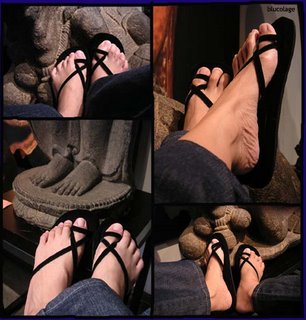
Digital Art: Kakiku

Inspire Me Thursday: Body Parts


I took photos of my feet some time ago while I was waiting for photo-taking session to finish in my art shop. It was hot sunny Sunday. I was bored waiting and rested my feet on stone sculptures I have. I had camera in hand.

I started to take one. Ehm interesting… I took more. Later I enjoyed using these photos for my exercise to master Photoshop, my latest interest. I have not done well with the arrangement that I needed to draw black lines in between photos. It was a challenge to keep hand steady while drawing a ‘straight’ line. It looks naturally drawn by hand tho..

Enjoy a part of my stone sculptures and.. kakiku!
(Indonesian for my feet)

Art Journal: Different Eyes


It took me two days to finish this artwork. It’s not because of its intricacy but.. I needed good light to glue or double-tape. I used two gift wraps as base (not easy to fix on) and a clip says “here & now”.

This piece is about my experience in Singapore apart from shopping the Singapore great sale. It’s all about art and discovering the city. Riverside walk, Singapore Art Museum, Holland village, and Little India. I fixed a flower with message I randomly picked from a bookshop. The lady offered me a basket of messages after I paid my book. Like having fortune cookie, nice and surprising. The message says:

You do not hide the treasures in your heart in fear they will be stolen – but share to find they multiply.

I also fixed my MRT ticket (which is not as interesting as it was) and my skirt label – Projectshop. It’s an interesting Singapore label that has drawn new customers thru me. Smile.

This work called Different Eyes. This visit, I experienced Singapore with different eyes.

29.6.06

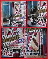
Documentary Art: Blogg


Yea.. strange term: Documentary Art. The term popped up when I thought that Clip Art is not the exact term for this art.

Last April, a good friend told me about The Economist did a special report on new media. I bought the magazine and really liked the report. It’s a comprehensive report on interactive journalism, wikipedia, podcasting, and for sure.. blogging.

I kept thinking about archiving the news because it is so revolutionary. It marks history. This clip art idea helped me. I turned the archiving into something nice to see and enjoy while I could still read the report. Not all of course but the main one that closes to my life.. blogging. Ten years from now, I believe, we would see this report with different point of view. Perhaps it comes as soon as five years as technology developed fast.

I made this piece of work different than others. It has flipped side. Space was too small for the info only, so I added folded extra to do the art. The idea worked very well. To add dimension, I glued my expired Singapore cellphone chip on the page. It will remind me of the place I made the artwork.

This time I realized that smearing glue is an art itself. Papers go curly and flexible. It wrinkles sometimes, or cannot be straight because of its softness. Ugh.. I worked extra careful to create smooth straight result. I’m not that successful tho.. some parts wrinkled and bended. I also don’t like to see the tiny gap between two clips. I found it hard to make it close and straight. My perfectionism. My only soothing words is...
It’s handmade!!

Enjoy blogging!!

24.6.06 7:58 Shavilla

Clip Art: look out! stay in

Artwords: Minimalism


Time almost runs out to submit this week’s challenge. I got back from holiday yesterday but wanted to participate. I quickly browsed magazine I had to get ideas last night.

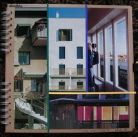
I found some house or apartment pictures in similar style. Windows or balcony with railing. No matter where, hi or low. It gave me impression about people have to stay inside, but can always wander by looking out thru window.

The composition shows four different window styles. The last of three panels shows a man looking out using binocular. Confining self inside house.

I arranged the panels Mondrian’s style with colored lines sticking out the panels.

Enjoy looking out!

26.6.06

Clip Art: ..are they??

Inspire Me Thursday: Open Studio


Interesting topic this week, Open Studio. Again I made collage – which I like to call clip art.

I spent weekend and a few days of this week in Singapore (1.5 hours flight from Jakarta). I brought with me minimal tools to make collage when I’m traveling. It’s a new habit. I made one on the first day of my stay, Blogg.

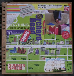
I made ..are they?? on the second day. I woke up early and was inspired by leaflets and brochures I picked from airport and those available in room. I have been in many sale season in Singapore (May – July), it would be nice to record the event this time.

I was especially attracted by Orchard road map. Orchard is the main shopping belt in Singapore -- where I usually spent my time. I didn’t check many shops, only shops I liked. I’m a fast shopper. I don’t do window shopping a lot (except I have girlfriends with me. I enjoyed following them.)

Okay. I have Orchard map as base and the event announcement on top. I didn’t glue the word SALE so it looks like tag. I showed three shops I used to check. Then I drew dots of my track from hotel where I stay this time to all of three shops I used to visit using marker pen (I left my gold pen). I fixed first coin I got from my first shopping to make the piece alive.

I got the right quotation from a magazine, it says Happy days are here again – or are they? It said to me. It asked me. So, I put it as main soul of the piece.

This piece is more like journal to me.

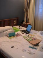
The studio? Of course, my bed in my hotel room. It’s good that I took the picture. I was mesmerized by the mess I made. Now I can share the photo of my studio and the art I made.

Enjoy shopping!

20.6.06

Paper Collage: To A Tee

Artwords: Transformation


Artwords has challenging challenge this week. Transformation. It took time for me to ‘grab’ the gist of transformation (to be expressed in an artwork). I know about “going beyond your form”
but how…? I tried to make series of my pictures into a digital artwork but… I could not see significant ‘transformation’ on it. Ugh. I was going to give up..

I went back to art I like – collage. I made collage using Newsweek recently and I had squeezed the magazine to dry.. Only few left. I changed to Swedish interior magazine a friend gave me. Mm.. flipping flipping..

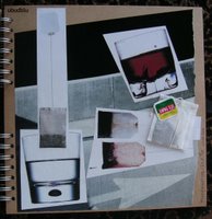
Then I found this. No.. not tea advertisement, it’s glass-ware. Typical Swedish, advertisement looked modern and neat. It became perfect after I found ‘the background’ from car advertisement – it has arrow. Arrow associates with transformation, right?

I cut the pictures the Swedish way, clean and straight (I left the right edge naturally furry so it won't look too boxy). I played with the lines. Mm.. I enjoyed composing. A tea bag into a glass of hot water, then two tea bags getting red after infusing below a flying glass of tea. I fixed a real tea bag of my favorite legendary local brand, Tong Tji, to make the total artwork alive.

Toast!

Clip Art: Harsh News


The idea came just before I heard about my uncle. I was idle waiting for mood to shower. I opened the already torn Newsweek again. This magazine was particularly unique, I found a lot of hard expression. I’m not sure whether in this edition only, or any Newsweek is similar. I’m not the reader.

So I cut cut cut.. Then I got the bad news. I continued cutting and shaping while thinking about what to do because it was almost midnight. In less than 25 minutes I had started to layout. I closed the book and continued to do this afternoon.

I applied a new method. I glued the clipping on a colored sheet. It went curly after I finished gluing all. Ugh. I pressed it under a stack of paper for awhile to straighten. It worked fine. Then I attached it to the notebook using wide double-tape instead of glue. I’m happy with the result. It stays straight flat and stiff. That’s perfect. Now I learned a new way to get better result when using glue. Combine with double-tape.

Enjoy!!

19.6.06

Scrap Art: Photo in Frame

Inspire Me Thursday: In Good Time


I was excited to do this week’s challenge “in good time”. At first I was thinking about creating art in ‘good time’ (= good mood) but hey… it’s about ‘reasonable amount of time’.

That’s perfect! I had delayed homework. I want to give my staff’s girl, Lita, a 1st-birthday gift. I have a nice photo of her that I made about a month after she was born. She was a beautiful baby. Very peaceful. I like the photo very much that I liked to show to everybody.

I already had the frame and plan in mind. And 30 minutes was just the right amount of time I needed to finish the project. But collecting scrap to use in project needed longer time.. I guess we could not create a project from zero in 30 minutes. I believed I spent some 20 minutes to dig my drawers to find small pieces. Digging needs creativity too!

I opened my torn Newsweek again to find nice words for the frame. Again I chose Newsweek for its paper characteristic, thin but strong. I decided to put Inaugural 2005 (from Bush reportage) on left top; then I found peace which is perfect for her expression (left bottom); then Jesus for she was born in good Catholic family (right bottom); and finally photo of a line of laundry to ‘remind’ her of her womanhood and for fun (right top). Just before I closed the Bush pages, I read has big dreams in nice right-size font and color (center bottom). And of course, as my signature, the “kidnapper’s font” of her name.

Frame done. I sewed four colorful paper clips to remind her of education (I left the last one dangling). Then a Rupiah coin launched in 2005 (the year she was born) and a Hongkong coin (I didn’t have time to find Yuan, but Hongkong is China now.. anyway). Why is China coin? It says “learn as far as China” to ensure her to spread her wings. Then on the right bottom I fixed a game token -- I found in my pocket years ago -- to remind her to play. So I hope I have covered all ‘messages’ about life as a woman.

Finally, I wrote a short birthday note in the back. I timed my project, less than 30 minutes. Yay!

16.6.06

Art Journal: The Buyer


I didn’t intend to do an artwork today, although I intended. ??!???!? This way, I planned to make an artwork but I had no idea. I got the idea when I cleaned up bedroom. It started when I found a name-badge given at the craft fair last week when I went with three ladies. We had to register under a company name, so everybody was FRA’s employee ha ha.

What’s so special about the name-badge? It said BUYER. I just liked the idea. I collected more papers that could go with the ‘buyer’. Again from cleaning, I found recycled paper ex gift wrap from a good friend. Then I tore my favorite dark choco wrap which I found half bar inside one handbag (yes, I have treasure inside handbags).

Started with three materials, I dug my magazine-to-go pile. I chose Newsweek for I liked the characteristic of its paper. Thin but strong. I had other reason too. Then I browsed the pages, thinking about making ‘kidnapper font’ out of the pages.

I chose “Signal Lost” because of its big font but I liked the words too. Nice wording for ‘base’. Then “meet the voice”. Mm ya, I also cut out four letters to form “ONLY”. The word goes well with the notion of “buyer”. Base done: name-badge, choco wrap, and kidnapper’s font.

And just before I started to lay out, I found a little message I got from inside a fortune cookie at Marriott’s sidewalk coffeeshop in Singapore in December 2004. I kept it for so long unintentionally and.. intentionally. It’s interesting because it says “The root of your true love will spring from a friendship.” With smiley too.. I put small golden cotter pin on it.. to secure its existence. Smile.

This time I glued all surface to get thin flat artwork. I like recycled paper’s furry edge so I rarely glued it. Notebook’s paper is good, not thick but thick enough for scrapping. I made one mistake tho, I didn’t smear enough glue in the center of the yellow paper on top. Uh.. It bubbles now. I left center space empty for future material. Ongoing artwork..

But I have decided on the title .t.h.e.b.u.y.e.r. And what a nice date today 16.6.06.
13.6.06

Art Journal: Kaki Topangku

Inspire Me Thursday: Show and Tell Art


The SHOW is shown in slideshow. Below is the TELL:

1/10 The blank first page: I bought this spiral notebook at Borders Singapore just after I had PLV. I planned to make art-journal of PLV visitors. I just made six lay-outs but never finished the work. I stopped tracking down PLV’s visitors either.

2/10 Lay outing papers: I printed Ubudblu header on orange paper and tore the edge, then print my feet Photoshop-picture I made two weeks ago. Chose more recycled papers for background. Placed the lay-out draft.

3/10 Lay outing things: I checked my sewing kit drawer and was mesmerized by stuffs I collected from many travels. Bags of stone for necklace. Strings of beads in my colors. Lots of strings (many sizes and colors), wire in colors, elastic, and more materials. Tools! (at least four types of pliers). Oh. Where was I?

4/10 Smiley pin: I found this pin among the rubble in the drawer. I decided to fix it on band that ties the notebook. To remind me to always smile.

5/10 Book cover: Yes, the cover looks the same as the inside pages. It should be nice to have decorated cover but I save it for later. Long term project.

6/10 Close up header: That’s the final look of the header. I put stitched badge in the shape of universe with a little alien (me) on top. I had it for torn jeans but never had time to fix (better bought new jeans he he). Universe symbolizes “my world”, Ubudblu. I also drew a blue star. I am the star.

7/10 Sewn sand-beads: I sewn four tiny beads in four corners of my feet picture to look like nails. I chose four prime colors: blue, orange, red, and green.

8/10 Sewn (hook-n-)eye: I found an eye (without its hook) in thread box. I decided to sew it in the header as my “eye”. I fixed one side only so it dangles; meaning my eye should be free to see.

9/10 Title “Kaki Topangku”: I wrote “kaki topangku” using fluorescent oil pastel I bought at Spotlight Singapore. First time I saw fluorescent pastel. It does well in artwork because the color comes out. I also scribbled on the picture side to give effect to the whole composition (if I did right). Finally, I wrote the title of the artwork (same “Kaki Topangku”) using 2B pencil on left down corner. I put dates too! Like an artwork he he.

10/10 Finished page: That’s how it looks from distance. I was not happy when I saw the picture but after four hours now.. I like it more! It took me about 50 minutes to create: from lay-out to finish. Not bad for first page eh?

By the way, why Kaki Topangku? Literal meaning: (My) feet my support. I respect this part of body which supports the rest of the body and maintains balance when standing and walking. Keywords: self support and balance.